This picture was my first photoshop image two weeks ago. The goal in the lesson was to add some pictures we found on the Internet and combined them into one completely new image, by using different ways of marking a piece from one of the pictures we have and copy and pasted it into a completely page.
I actually liked how my image turned out. To me it looks kind of real, but maybe that's because I'm just new at photoshop and maybe later when I get some better Knowledge on it. My opinion might change.
I actually liked how my image turned out. To me it looks kind of real, but maybe that's because I'm just new at photoshop and maybe later when I get some better Knowledge on it. My opinion might change.
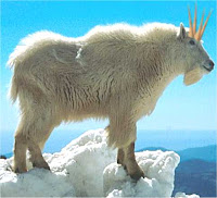
Here are the images I found on the Internet and used for my picture. From left to Right.
Here are some more images I found but didn't use.


I didn't use them because taking the tree and the deer from their pictures was tough and so I just left them out of the picture.

For illustrator we were looking at it's functions, like font, shapes, fills, and modifying them.
The teacher told us to make a logo.
So I thought for my logo I would go for an ancient Greece look, by giving it tiles and some textures around the boarders. However I gave my name a weird out of proportion look.
Last weeks in photoshop we were learning different ways of editing pictures by lighting up the pictures and removing certain pieces to makes the photo look better, and editing pictures in layers.
The first picture we had to edit was a badly taken image of a bridge.
everything was too foggy and blurry to see so we had to darken the light areas and lighten the dark areas. and i thought this was kind of cool.
First image and edited image.
Next we had to remove objects in the picture and just leave the plants and the hills by cloning and smudging some areas.
This was also fun to do because if you look at the edited picture it looks like the people, sign and the stone are not there. It's a shame i didn't remove the bridge properly.
This was also fun to do because if you look at the edited picture it looks like the people, sign and the stone are not there. It's a shame i didn't remove the bridge properly.
First image and edited image.
The last image of that week was editing pictures in layers.
Once again this was fun to do because you can edit anything one at a time.
Once again this was fun to do because you can edit anything one at a time.
from the cream on the cup to the background.
The tutor told us to just remove the cream on the cup, using the masking tool.
Once we finished that, he then told us that using the colour black will make the cream invisiable, using white will make it visiable and using grey will make it see through.
I won't post the illustrator work because it was the same as the last one.
Finally this week photoshop and illustrator works.
For the photoshop one we had to merged all the images into one big picture again.
To tell you the truth I thought this would be a bit boring but it wasn't.
the final picture looks great, it gives off an apocalyptic feel.
Here are the images we used in our picture.


No comments:
Post a Comment