Well this is what I got from both
For the setting the mirrors will actually take place in a maze, still deciding on the time, maybe Victorian. I got some reference images to help with this idea for a mirror maze.
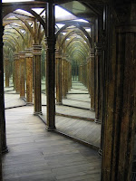
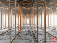
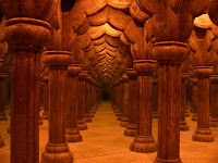
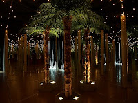
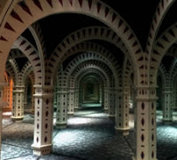
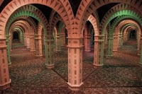
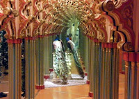
My painted pictures
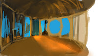

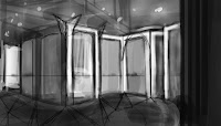
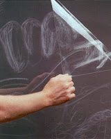
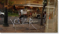
And on the mirrors I will add some scratches on them to show the type of people who went in, if it is a one big line than it's someone who is making a path to get out of the maze, arrows to show someone is ruining everyone's fun, graffiti scratches for vandals, big scratches for someone who doesn't like their appearance and/or one big broken mirror.
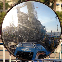
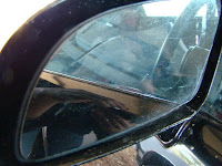
Here are some examples of scratches.
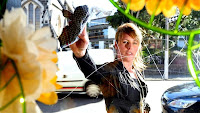
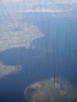
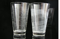
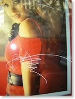
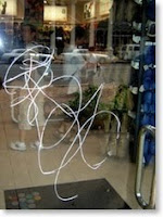
Are the ideas that I came up when Photoshop Phil and Goodwin gave me their advice are good or am I missing something?
Evening Shahbir,
ReplyDeleteI think you've got a really nice idea with your hall of mirrors idea - and I think keeping it simple is the key - look at your resource images 1 and 5 - very atmospheric, with an emphasis on lighting and shadow - I like your digital painting - maybe drop the camera view closer to the floor for added menace - but, in truth, I want you to produce something elegant, simple and sophisticated. I don't think you need much else, as the mirrors are your uncanny object - let your concept breathe! Go for it, Shahbs - just get started :-)