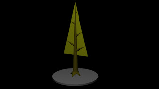
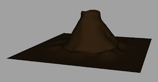
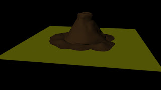
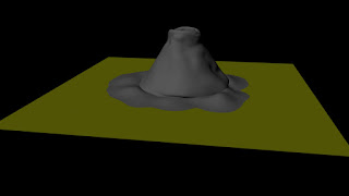
Here is the latest update on my work. First I have finished making the entire tree for my animation, when looking at the images you can see the type of changes that was done to the bottom of the tree. The first two images made the bottom look kind of chunky and I did not like that so I have redone the entire stump, to me it looks much better. The new stump can be seen on the last two tree images.
First Tree Design
First Tree Design Bottom Close Up
Second Tree Design
Second Tree Design Bottom Close Up
I have also applied a texture to the tree to see how it looks, I am actually okay with it because it has the simple feeling I was going for. I have actually talk to Phil about this and we decided that although the texture is good we think that I should add some lines on the tree for close ups. He also suggested that I should also add some grasses on the tree to give it some more shape.
Finally some test renders on my scenery for my animation, and already I can see that this scene needs serious help. First the colour of the grass and the colour of the tree bark are the same, the shadows and lighting needs help and some of the trees are fusing to each other, I have talk to Tom about this and he gave me a helpful tip to fix the trees which is 'instancing' the objects. However I think I will talk to Alan about working on the shadows. I did two different light renders on this scene to give some brightness to it but I will still work on setting up the necessary amount of brightness on the scene so it would look nice to look at.
Low Instance Render
High Instance Render


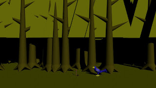

shahbs - you need less trees in here - and you need to include the sky etc - and everything is too khaki...
ReplyDeletethanks for the feedback :)
ReplyDelete