Monday 30 November 2009

Invasion of the Body Snatchers!!!! review

Today I have watched the movie 'Invasion of the Body Snatchers', 1956.


The story of film is about aliens, who are all ready on earth and are taking over the planet slowly, one at a time. And when the main characters was telling everyone about this no one believes them.

I have to say this film is really good, it started off slow, but picked up alot in few minutes. Which I have to say quite impressive. When I heard about this movie I thought it was just an ordinary horror science fiction film. And I'm glad I was wrong, it's more than that. It's a science fiction film that actually captures my attention. Because science fiction films nowadays focus on explosions and action, some of them have a story that is golden, and bodysnatchers is one of them.

The entire film was narrated by the main character who is a doctor of his small town. And when hearing his story I felt that that the film could be a crazy story brought up by the doctors mind, I mean proper clones of people that came out of a seed or weird shape cabbage which is actually an alien, that sounds a bit too far fetched for me.

It also seems the movie is more than a science fiction film. That it has some relations to peoples reaction to Communism. Communism focus on making everyone alike there is no difference. and the movie focus on the bad side of communism, that being like everyone else is not a good thing.

John W. Whitehead, reviewer on Gadflyonline, explained that 'Body Snatchers invokes at least a double reading. It was both a mirror of a particular moment in history and a compass indicating the symptoms of a growing societal illness. Following World War II, the atomic bomb and the Korean War, Americans were confused and neurotically preoccupied with international political events—much like they are today. Siegel’s film addressed the dehumanization of individuals—a sensitive subject in an age filled with tales of political brainwashing of American soldiers by the Koreans—and the horrifying possibility which arose in the 1950s where humanity could become infused as part of the machine.'

Invasion of the Bodysnatchers have some impressive special effects, most amazing effect has to be when the pods has started to open, and the contents inside them started to take form.

The camera angles are impressive, especially near the ending. It has one of the most scariest moments I have ever felt, because the Doctor was warning the public that they are in danger. Aliens have come to take over our lives and I'm next, it's like the Doctor was actually talking to me. I think the camera angles of that scene really helped a lot to give the ending more of an impact.

But what I really like about the film was the setting. The idea of everyone who knows each other for a long time, just all of a sudden changed into something inhuman, was really good idea.

This movie was really entertaining, the setting, the story, how the movie has more than one meaning. All of was done so well. And when I heard there remakes of this movie I might do a review on them to see the differences between them. But for now Invasion of the Bodysnatchers, 1956, really is something that I enjoyed very well.

Unit 3 Environment

Hay everyone, today we are starting our next unit, environment.
Basically we have to make a scene but with a mix between 2d and 3d the back has to be in 2d digital painting and the objects in the foreground has to be in 3d. No people just the objects. The essay for this unit needs to focus around the uncanny of object, paintings, games, film anything which has to relate to the unit.
To tell you the truth I am a bit confuse about the essay but Phil said that he will explain it tomorrow.

On this unit Phil gave the class some films to review films that have surreal or uncanny environments.
The word uncanny means something that's out of the ordinary.
The films I will be looking at are:
Invasion of the Bodysnatches, 1965
Dead of Night, 1945
Repulsion, 1965
The Stepford Wives, 1974
Halloween, 1978
Poltergeist, 1982
and
Blue Velvet, 1986

I just hope i will do better on this unit than the last two :(

Sunday 29 November 2009

Maya Building 2

For three days I been trying to finish my Maya Building week 6, here it is so far.


I still got four more parts to go.
all I have to say about the process is that it's going well,
there are some bumbs here and there, I thought I might meet allan and ask some of his help on a texture, as well as ask him to help me set my own preference for my maya

My Final 3 Concept Arts

Before I start talking about my 3 concept arts, II must say that these aren't my best works. I made all three of them in two days with only the sketches as my guide. I didn't pick out the type of colours to use for my pictures, I followed my instincts, which wasn't a good idea. basically it all has to go down to bad time management, so my goal is to make time for all of my works.


The first picture is of the house of Usher. I wanted to use the sad colours to represent the atmosphere of the house. And to tell you the truth it did sort of worked but there are areas that needed a lot of work. For example the windows could of been a more darker blue or any other dark colours. The tree on the foreground could need a lot of work and I should of made the grassy fields more interesting.


I used the image underneath as a reference for my house.

[Close Up]


[Zoomed out]


The next concept art is the pit.
The picture is just a dungeon with a hole on the floor. I think what would of made this scene more interesting if I put some objects in the background, because when I was reading the story, it turns out there are more torture devices then just the pit and the pendulum. What I really find disappointing is how the metal walls turned out, they look like giant ice cubes.
In the criteria Phil said that it looks like a hole on the floor, and I think he's a bit right, but aren't pits are just holes in the floor. I think what might of made the pit more define if I did the shot from a different angle and put in some details on it.


Finally my last concept art. This is the pendulum.
There are parts that I am pleased of how they came out, like the bolts on the pendulum and the holes on the strap. But I didn't like how the metal walls came out as well as the pendulum.
First the pendulum, the blade looks nice but the wood beam is too thick, I should of slimmed it down a bit to make the blade look bigger.
The metal walls just don't look metallic,they just look bland.

My 5 Perparatory Drawings

Here are my 5 perparatory drawings, they are all sketches of my three main concept arts.


concept art 10

Here are my last concept art sketches of scenes from the two stories that were given to me, The Pit and The Pendulum and The Fall of The House of Usher.


First sketch was of the dungeon room with the pits in the center and the pendulum next to it, with a piece of wood underneath the pendulum.


The second sketch was the same layout as the previous sketch but at a different angle.


The third sketch was the a more of a close up to the the pendulum with a big plank of wood which is meant to restrain the prisoners for their execution.
I also added some straps to add to the effect.


The forth sketch was of the Usher house, this is what I thought the house would look like at first when I was reading the first few pages.


some more designs of the Usher house, deciding which angle to look at the house from, what type of shape it will have, and what the grass would look like.


The next two images are notes and small sketches to get the idea of appearance of the house.


The final sketch is of the house from the inside. I wanted to do the inside of the house because I fought it sounded more interesting the the outside. The down side is that I left my work to the last minute. My advice to those who are reading this, don't leave your art works to the last minute or you will not bring your artwork to it's fool potential

Monday 23 November 2009

Photoshop Drawing lession 2

I did a drawing of of m pendulum in photoshop, but I think I forgot to save. To me thats okay because I messed it up so badly, but at the same time I might of needed it as a reference for future pendulum pictures.

concept art 9

Here are some concept are from today, still focusing on the pit and the pendulum
On first sketch I was making a metal wall, because in the story the walls are made of metal.
The second sketch was my own idea of what the pit has in the bottom.
I did this to show there where more then one prisoner who fell into the pit, but I also wanted to add a type of double meaning. Making the dead prisoners as monster that want to bring the main character to hell.


The third sketch is a different perspective of the Pendulum, seeing the sight of it at the same level of the main character.
On forth sketch I was just redesigning the pit by giving it a ring of bricks.
On the fifth sketch I was still wondering where the pendulum is placed, because it needs a lot of room for the swinging motion.


The last two sketches was just an experiment to see what type of effect the picture will have if I added the pit and part of the room at the top and showing the inside of the pit at the bottom.
Let me know if you think this is a good idea or a bad one.


Concept art 8

I did some concept sketches for my picture of the pit and the pendulum in 19.11.2009.

The first picture was a bottem view of the pendulum, as you see at the top there is a picture of an old man who represent time.


The next sketches are of the main character in the dark.
The first picture was of the main character wondering around the dungeon in the dark. I thought this would be interesting because we get an idea of the type os situation he is in.
The next picture underneath is the main character looking inside the pit that he nearly fell inside. I made the pit big because that is what he might think when he was in the dark.


The next sketch was to get the idea of where the pit is and how big is it.
I did this sketch so I will get an idea of where the pendulum is placed.


Finally I did a sketch of the pit and some concept designs of the blade of the pendulum.
I wanted the pendulum to look old fashion by making a metlal clam like box to make the pendulum connected to the wooden beam. I gave the pendulum some spikes because when I was reading the story the main character compare the Blade of the pendulum to the blade of a saber.


Maya Building

I have finished the first part of my maya building in the 12 of November.
I know it took took me a long time to update this, but I was busy doing my perception essay.


To tell you the truth, when I was making the first part of my building following the video guide was sometimes confusing, it was just too quick that I sometime loose my place. But when I finished making the first part, I felt pleased. Just thinking that I just start with a cube and I end up with that.
Can't wait too finish this off.

Monday 16 November 2009

My Photoshop Drawing

Here is my photoshop drawing. I was drawing my own image of what the house of usher would look like. I was going for a distorted world with a spooky atmosphere. I believe I have failed at that because I totally don't know anything about the house. I have read the story and wrote some notes, but I didn't really put too much effort in researching the house it self and the interior of it. I just thought that if I just look for them on the Internet and in books I would come up with something, but again I didn't.
So I am going to start from scratch and re-read the story of the house of usher like I am doing with the pit and the pendulum and hopefully come up with a good conce4pt art.
Any way here is my picture from my second and third session of my photoshop drawing lessions. I didn't went to the first one because I was sick, but i am better know.


Sunday 15 November 2009

My Life Drawings

I have been forgetting to put my latest life drawing pictures for a long time now, so here there. All four of them are the last ones for now until December.

The first one was poses and negative space. negative space is just drawing around the model and not putting too much detail into them.


the second and third drawings are just shading practice. And I can see I need a lot of it.


The final one was poses again, and I used this opportunity to practice drawing hands and feet in different poses.


What I am startin to notice is that my drawings are getting bigger which is great.
Here is an example:

Friday 13 November 2009

my concept art 7

Today I carried on reading The Pit and The Pendulum, and wrote some more notes to get a better understanding of the story.
What I am really surprised about is that I missed some very important detail in the book, like the dungeon is squared, and the walls are made of metal, while the floors are made of stone.
And I also missed the shape of the pendulum, I thought the end was a circular shape, but it wasn't it was crescent shape.

Here are some more scans of my notes and doodles.
also some reference pictures to give me an idea on making the crescent pendulum.


Thursday 12 November 2009

my concept art 6

Yesterday I was also re-reading Allan Poe's The Pit and The Pendulum while doing some doodles to picture the events in the story at the same time. I was making a scene when the main character was being engulf by darkness (sounds cheesy).
The last image was just an experiment I was trying out, which was inspired by Jolanta's own drawing of the sable draperies. I like the way how she did it I thought I could give it a shot. I don't know if I will stick with this though because it's not what I was going for, for my own idea of the dungeon.
I have also taken some note's of words in the story that I didn't understand and put in meanings which fits the story so I can read it a lot easier. This really helped me a lot and gave me a better understanding of the area the main character is in.


The next scan is about the image I had in my head when I was reading the part in the story when the main character was wondering the dungeon in total darkness. I also did some more research on the clothes he was wearing, just in case I need to add him in my concept art and I was also curious what a coarse serge was, it turns out to be a poor condition clothing that poor people wore in the olden days.
I also did some pit designs aswell and it was really hard, the hard part was to try to fool the viewer in believe the deepness in the pit.

my concept art 5

I didn't do much yesterday, I was just flipping through my book about gothic architect and I found these two pictures. I Chose them because they look very spooky and surreal.
The first picture is Oxford, All Souls College, Great Tower,
and the second is Beverly: ST. Mary's Church.
Out of the two I like the appearance of St. Mary's Church the most, because of it unworldly appearance. While Oxford, All Souls College, Great Tower looks more like a castle and I wanted something more bizzare for my Usher House.


Wednesday 11 November 2009

Question for my essay

For my essay I will be talking about Ghostbusters The Video Game concept art and drawings.

Since some of the enemy characters fit certain areas in the game. Can I talk about them?

Can I use screen shots of the game in my essay?

Can I do comparisons with the characters and the ares in the game to the movie, example, the fire house and seadge wick hotel?

Can I talk about the concept artist in the game and see other projects he/she done and see if they put any of their old designs from other games into this one?

Sunday 8 November 2009

What I watched today

Today I have watched a documentary about Annie Leibovitz.
The reason why I was watching her documentary is so I can have a bit more understanding of perception.
The film show's what kind of person Annie Leibovitz is, what her photos contain and how she became a photographer.
After watching this I felt that I have learnt a bit more about Perception. Which is that photos need to mean more than just pictures, they need to tell a story or talk about the subject. But all of this is about the meanings in photos, what people think about when looking at them? And how does it make them feel?
When I was looking at the photos, Annie Leibovitz have taken, I really like how the colours set the mood of the picture, and the outfits the subjects have to were to make the photo that much effective.
All I have to say is that the documentary was really good and I felt it did helped me a bit on understanding perception on photographs a bit more.

Friday 6 November 2009

My concept art 4

As you remembered yesterday, I posted a picture of this house


Well I did a sketch of it to help me think of the shape of a house, I tried using the two big light to make building out of them for my sketch, but they didn't turned out right so I just drew the shape of the building instead.


I need more practice in making buildings. I also think I need to re-read the story of The House of Usher to give more of the iddea of what the building look like.

Thursday 5 November 2009

My concept art 3

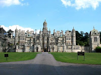
I found this picture in one of my borrowed library books and I now it's not old looking, but I just like the size and the length of the building.
With some editing to making this house look old and Gothic, it will be one haunted house.
sorry for the two whit pillars the took the picture with my camera.

The Haunting (1999)


When I watched The Haunting(1963) yesterday I liked it a lot. So when I heard about the remake I was quite interested to see how different it is to the original. Oh boy was I in trouble.
The story about the film is the same as the 1963 version but with a villain. Huge Crain, the owner of the house, is the one who is scaring people.
This is where the film loses to the original. The 1963 version only villain is the house and it worked because to everyone the safest place is one's own home. Seeing it playing mind games with you is what no one wants, but having Huge Crain as the bad guy made this film too predictable.
When I was watching this film I notice it used too much CG, and I had it admit at points I can see what they were trying to go for making the house as one big life form and it sort of worked, but at times it was silly. Especially the part when the house was trying to have it's way with Eleanor in her bedroom, at lest that's how I see it, and the whole idea of having Eleanor as a savior was stupid, I am dead serious. When see died in the end, she was in a pose like she was crucified. I rather have her as a crazy person. But What I find really disapointing in this film was the way the house look from the outside.


I mean it looks cool but it looks like an entire city or village just merged into one, how can any one live in that I have no idea, and it looks nothing like the poster. This film didn't feel like a horror film it felt like a silly action adventure with some scares here and there.
My advice if you want to see a film that have Owen Wilson in a sucky horror film watch it, other than that avoid it.